The year 2024 will be marked by many emerging web design trends like: 90's nostalgia, the continual rise of dark
mode on mobile and desktop, accessibility, artificial intelligence and more. In this post we'd like to touch the
surface on a few of these trends and how they will impact the internet, web design and digital marketing as a whole.

1. 90’s Nostalgia
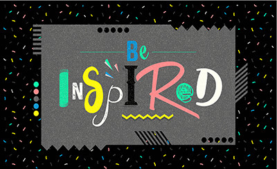
The 90’s was the beginning of web design so this era was defined by website graphic/design experimentation. The 90's had sort of an "anything goes" type of feel with the more quirky, the better. The playful, bold designs of the 90’s seem to be making a comeback across many websites and other design industries such as furniture and fashion. You’ll be seeing this especially out of the web design community to combat some of the more sterile, run-of-the-mill template designs.
Think: block layouts, flashy graphics, contrasting colors, unique shapes and fun illustrations with 90’s symbols like butterflies, yin yang symbols and smiley faces.
2. Dark Mode
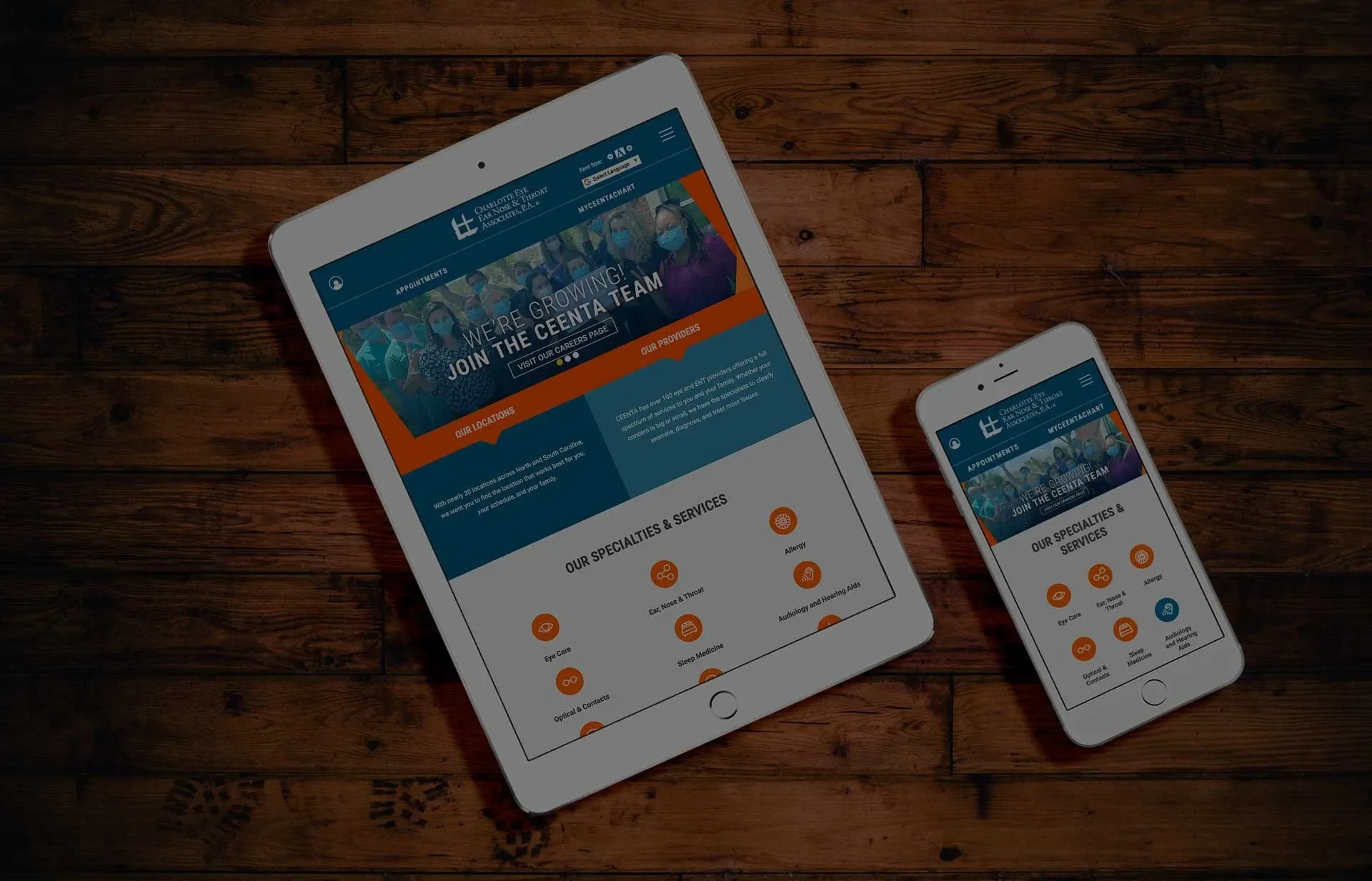
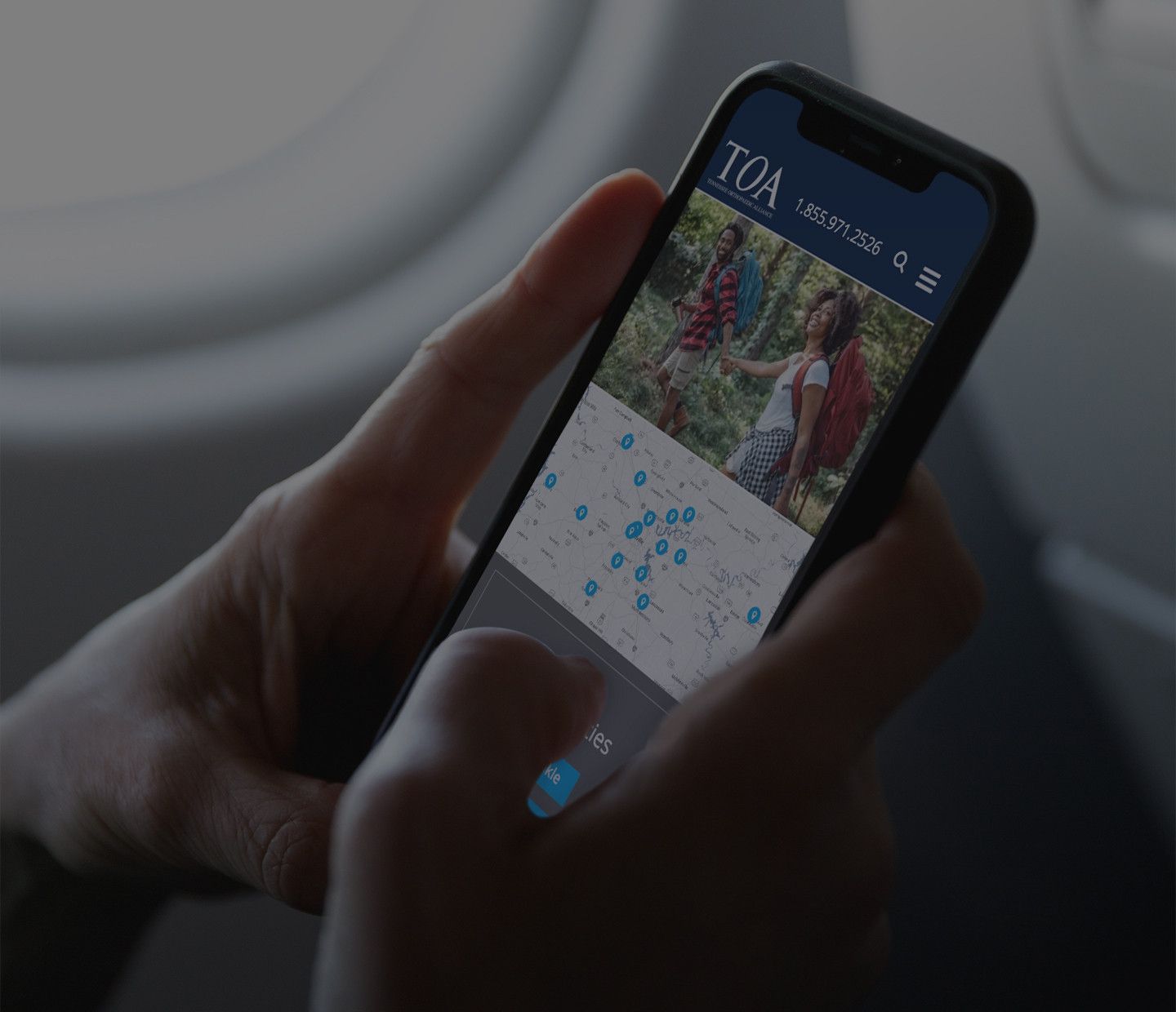
As screen time is on the constant rise, dark mode offers both a way for to sore eyes to rest and to extend battery life. It also helps in accessibility for those with sensitive eyes as too much light can cause irritation. Some find dark mode to also be more aesthetically pleasing especially on mobile and when used at night time. So in short, make sure your website is equally as accessible on dark mode to appease the many users who prefer this route.
3. Artificial Intelligence
2024 is going to be another year of continual advancements for artificial intelligence and this includes how AI will help support the design industry as a whole. AI will help designers find more efficient, automated ways to create designs that save on speed, user-friendliness and help enhance accessibility. AI can also be used for image creation, quick illustrations, branding guide creation, content writing and more.
4. Pink & Vibrant Colors on the Rise
You can largely blame the success of the Barbie movie for the rise of the color pink everywhere in 2023 and this isn’t expected to just suddenly end in 2024. Vibrant colors as a whole will be used more as highlight colors and background elements in illustrations, most notably shades of pink which represents femininity to many crowds. You just need to make sure there is enough contrast to make these color choices accessible for everyone, eye-catching and legible in dark mode. If you're not a fan of the typical pink color, you can use shades of purple which is considered good gender-neutral choice.
5. Noticeable Grids & Borders
You can expect to see more layouts with distinguishable grids and borders in 2024 as they provide separation and hierarchy of content. One example of where we are seeing this now is a design trend layout called bento grids. Yes, these are inspired by the traditional Japanese bento box if you are wondering. They serve a similar purpose: to section out specific places for content to feed into. This is a great advantage for those who visit a site often since they'll know where to immediately look when searching for specific information. Often, but not always, these are a one-pager site since the information is well-planned and divided.
6. Glassmorphism
Glassmorphism, better known as the "blur effect" is surging in popularity especially amongst mobile applications. This trend allows you to see background content as a blur while keeping the information you need to know up front. It also allows complex colors, illustrations and photography to take a backseat. Although this trend is currently being used, it is not new. It was first introduced by Apple in 2013.
7. Accessibility
Accessibility in web design is about allowing as many visitors and users to equally access and view your website as a whole. Many think it's just about those with disabilities but in fact it's truly about everyone across the web. For example, those using mobile devices and with slow connections need special accommodations; this is especially true when thinking about medical website design to have equal care for all. Accessibility is a part of a greater conversation on the internet and in society as a whole: inclusion.
8. Storytelling
Storytelling websites are usually one-page sites that grab your attention and tell a story through a carefully-planned series of specific photos, videos, text and call-to-actions. These sites can be used to tell details of a specific product or product launch, to shed light on a specific social issue or any other reason under the sun. One of the main differences in a storytelling site and regular site is the flow of content with the content exposing more of the story or information as the user scrolls.
« Back to Blog
Ready to Get Started? Contact Us Today to Schedule Your Discovery.

© 2025. All rights reserved. E-dreamz, Inc.

