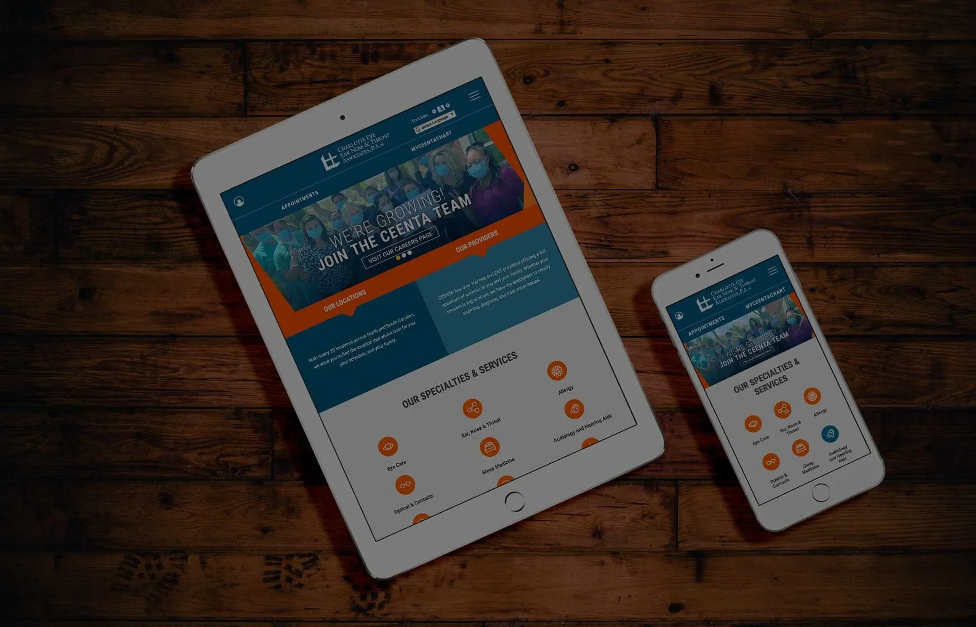
Mobile-first web design for the healthcare industry is essential and crucial. Consider a patient with a medical emergency: they’ll need to find the closest hospital or clinic.
During these emergencies, seconds may be the difference between life and death. Your medical website's design must immediately provide visitors with the information they require, regardless of the device they use to access it. We will assist you in creating your medical website by using tips or recommendations from some of the best award-winning medical websites.
What is Mobile-First Web Design?
Websites automatically respond and adjust to present their pages on a variety of computer screens and devices. When prioritizing responsive doctor web designs for mobile devices, we design where the most important characteristics of the website are visible to anybody using those screens.
Tips For Creating An Award Winning Medical Websites
Make Sure It's Mobile-Friendly
Medical practitioners should not underestimate the importance of mobile responsiveness. Users can engage with the material on their phones, tablets, and computers without squeezing or scrolling. Consider the frustration that happens when a patient is feeling under the weather and unable to contact the doctor since the website isn’t mobile-friendly and they can’t find the correct information.
Making your facility’s website mobile-friendly will not only provide a pleasant user experience for setting patient appointments for mobile users, it’s more favorable to rank in Google and Bing. Higher organic rankings will allow you to reach more potential patients.
- Design Tip: Make sure your team is constantly testing your site on mobile to ensure it continues to look good as more content is added over time.
Share Useful Information for Patients
Providing helpful information to your patient base will enhance your medical web design capabilities to new heights. The content then encourages existing patients to return to your website, while also attracting new visitors to explore the rest of the site.
Patients are more likely to make appointments or contact the office directly if their medical needs match your expertise.
Make It Simple to Navigate
The navigation process is an important piece of an effective medical web design. Your visitors may become unhappy and find another doctor if they can't find their way through your website. An unwell patient in need of medical attention doesn’t have time to comb through a confusing website.
- Design Tip: Limit your header navigation to few main links with well-planned dropdown menus. Check out TOA for an example of a dropdown mega-menu.
Integrate Compelling Images or Visualizations
An award-winning medical web design becomes more engaging with the use of relevant imagery. Content with excellent images normally outperforms text-heavy sites with minimal images. High-quality pictures let you show off quality where potential patients then begin to browse the site to see if your services are a good fit for them.
Include photos of your physicians, nurses, and office team so that new patients can visually see who they are setting appointments with. Videos and photo slideshows bring your website to life and give a human aspect to your healthcare web design that will remain with visitors. Photos of your locations are also important so potential patients can visualize going there and all around be more comfortable at your location.
- Design Tip: Invest in a photographer to come on site regularly to take photos of your team and locations if possible. If this is not always possible, don't be ashamed to use stock photography when in a pinch. There are some great resources out there.
- Bonus Tip: Don't shy away from using social media to leverage photography of your organization and brand.
Make Important Call-to-Actions, Buttons & Links Stand Out
You'll want important buttons and links on your medical site like "schedule an appointment" and "pay online" to stand out and be easy to find on desktop and mobile no matter what page you are on. Here at E-dreamz, we often utilize having our header and menu float at the top of the screen so this important information is easily accessible. We can condense the mobile menu to always stay up top too allowing a patient to be able to access this vital information as they browse the site on a mobile device. M
- Design Tip: Use a bold color or font to make your important links and information stand out against other links that are not as important.
Accessibility
Accessibility in web design and development is not just another trend that will fade away over time—it is key to ensuring your site is friendly for all of those around you no matter the circumstance or barrier. To make sure your website is accessible for everyone needing healthcare, check out the list of standards from W3.org. Contact E-dreamz today to make your healthcare website more accessible to all.
Top Healthcare Web Design Agency
E-dreamz has been featured in the top 30 Agencies for Healthcare Web Design by DesignRush. Contact us today to talk about your web design needs.
« Back to Blog
Ready to Get Started? Contact Us Today to Schedule Your Discovery.

© 2025. All rights reserved. E-dreamz, Inc.

